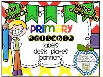
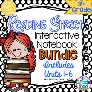
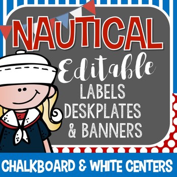
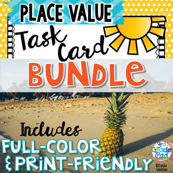
That said...here I go with Week One. Keep in mind that I am still pretty much a baby blogger and a baby TPTer. Still in this short time, I have evolved in my style and taste--much like if you look in your closet. You pull out a shirt and ask yourself..What was I thinking when I bought THAT?? The same goes for when I cruise through my store. I see a cover and think similar thoughts! What was I thinking when I put those colors together?
I have done a bit of redoing some covers this spring when I wasn't feeling very inspired to create new products, but I wanted to create some new life to some products that I PERSONALLY liked but didn't get much traffic.
Here is a prime example:
Well, I had the cute chevron thing going here. I had purchased a few KG fonts by this time, too. With a fresh eye though....the game title is clear enough, but you'd have to read the product description to really know what it covers. The Melonheadz cutie is sweet enough, but she is just....there.
While the game title still takes center stage, the buyer knows that tricky multiplication facts are the skill. Your entire piece of clipart does not have to be placed on the project. Peeking in and going off the page makes the product POP more and really shows the artistry of the clipart. I was OVER using glow. That is just SO last season. LOL! I know that I over did the glow. Substituting a black background has a much better effect in getting your titles to POP. In my opinion.
These Before/After pictures are part of a complete bundle that I updated this spring adding BLACK & WHITE versions to the original. Many buyers are ink conscious. Providing an added option pleases everyone, in the end. I try to let the buyer know on the COVER that Color & Ink-friendly Versions are included in one set.
If you are interested in these, I've marked them by 25% for this week only!
Click HERE for Tricky Multiplication I Have, Who Has
Click HERE for my Spring ELA Task Card Bundle
Can't wait until next week for a new challenge. I"m heading out now to see if I can some NEW fresh ways to look at my other products that need updating this summer!


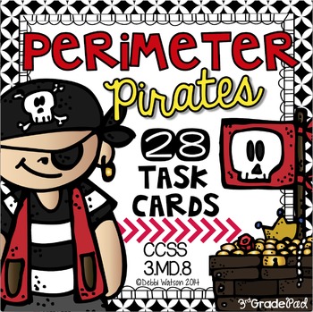
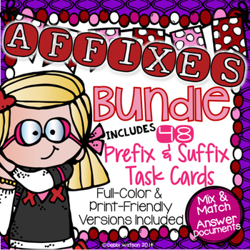
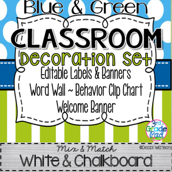
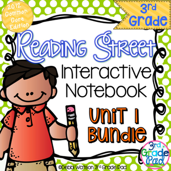
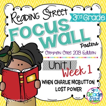
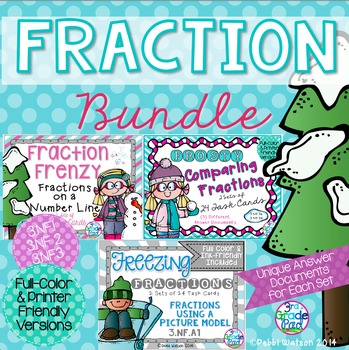


Awesome job! I am loving this challenge!
ReplyDeleteLove the changes!
ReplyDeleteCasey
Casedilla Crumbs in the Classroom
Cute!!
ReplyDeleteYes, yes and YES! Fabulously done product covers girl!
ReplyDeleteThey look GREAT! and all so consistent too!!
ReplyDeleteLove the new cover!! The background paper & the chalkboard bubble really make the cute MelonHeadz & your font pop! Awesome!
ReplyDeleteLove the mix of fonts and color scheme! You go, girl!
ReplyDelete~Jennifer
Stories and Songs in Second
Your make overs are GREAT!!! Moore to Learn
ReplyDelete